Web design trends we can expect to see in 2017

by Endrit Shehu
It’s that time of year where we look at the year that was and the year that will be. We’ve seen a lot of amazing website designs this year, and I’m eager to see what 2017 has in store for website and website design.
2017 is sure to bring some amazing website designs, but if we look hard enough, we can already start seeing some trends that are sure to dominate websites in 2017.
Emphasis on the content
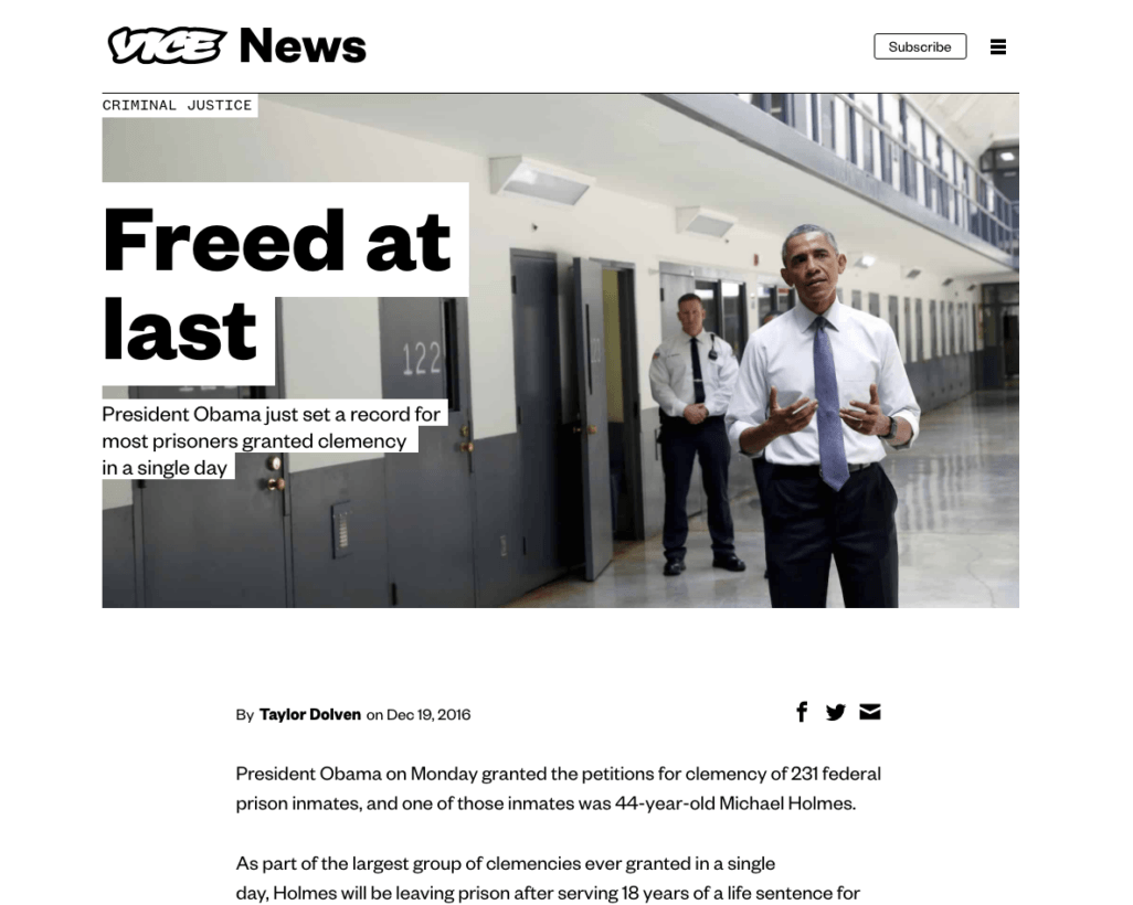
We’ve spent years adding things to our websites such as sidebars, headers, banner ads, sidebar ads, calls to action, comments, popups, social media buttons, signup boxes, etc. All of these things have ended up cluttering our websites and taking up more and more real estate, taking the attention away from the entire point of a web page: the content.
In 2017, websites are likely to start moving back to basics and placing more emphasis on content. Whether that means we remove all of the other distractions we’ve spent years adding, or just making them take up less real estate is yet to be determined. Getting back to the heart of a website — the content — will be prevalent moving forward.
The end of flat design
I think we’ve reached the point in flat web design where everything is starting to look the same, and we’ve lost our personality and creativity in design. When you strip everything away, you’re left with what everyone else has: the basics that look just like each other.
From my standpoint, flat design has turned from a modern update of skeuomorphic design to a set of design aesthetics that everyone applies (think Google’s Material). Because of this, sites are starting to look the same, and not much differentiates sites from one another. Designers feel that the creativity is gone, and with the desire to create something great, I see flat design ending for the most part in favor of layouts and designs that are more imaginative and unique.
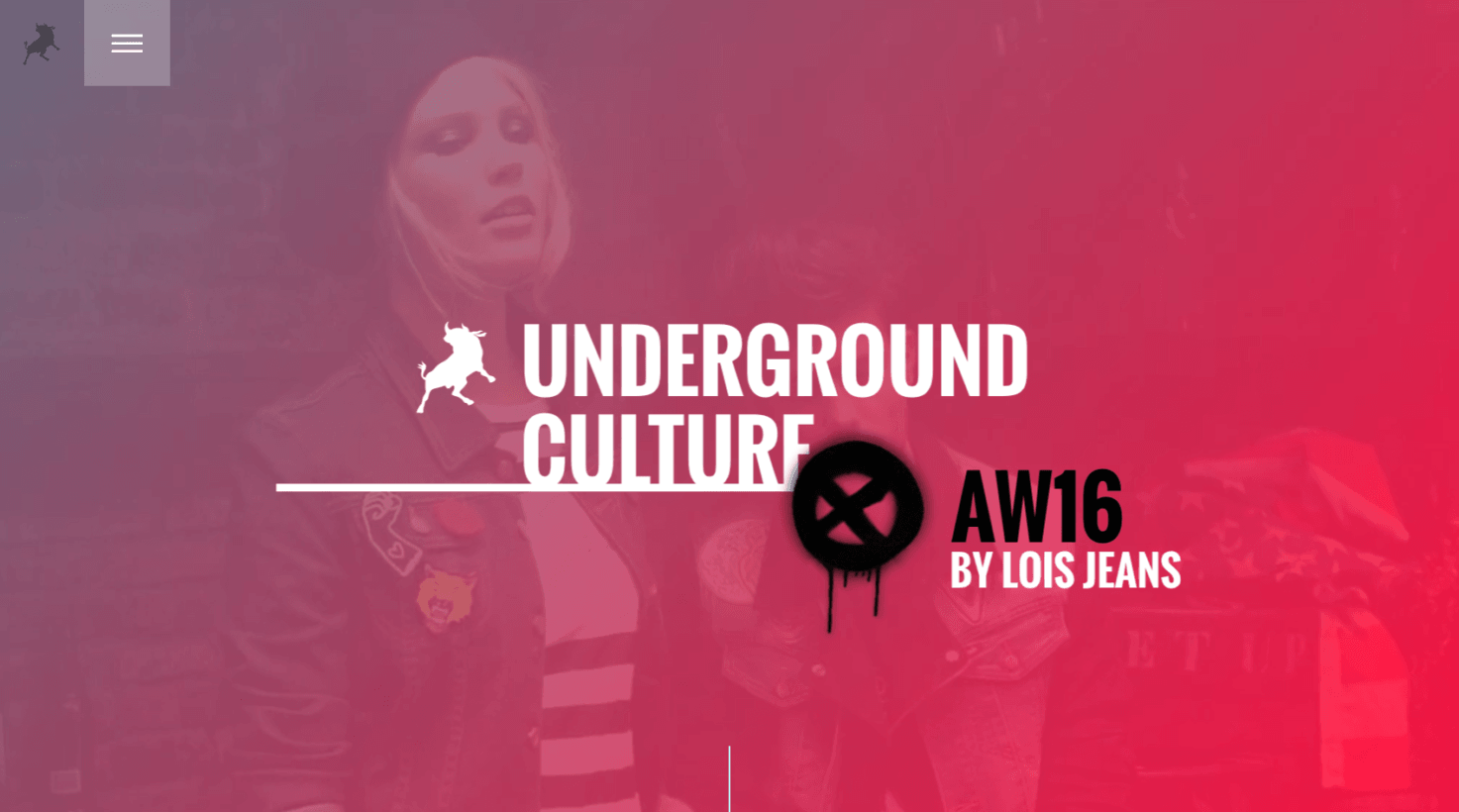
Geometric shapes, lines, and patterns
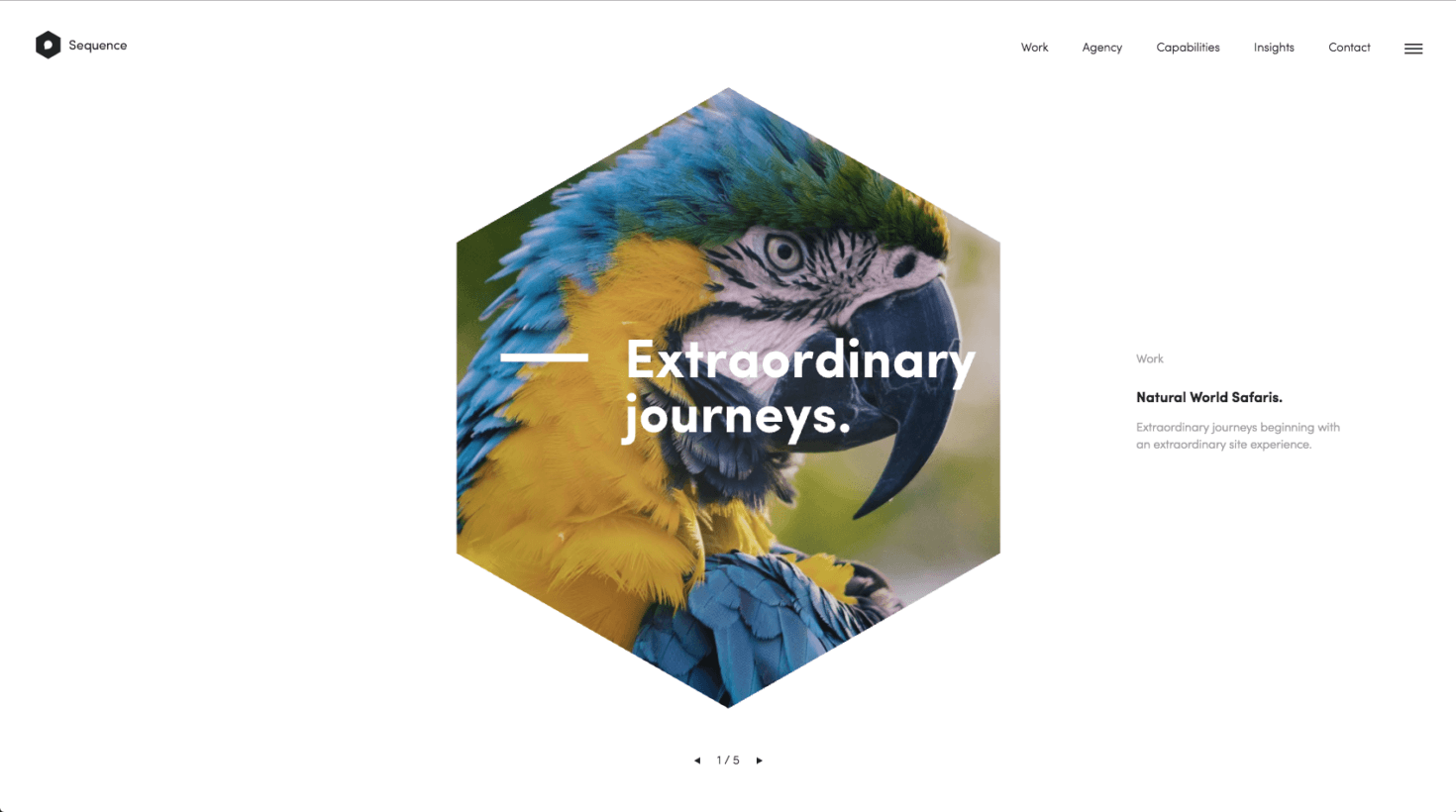
It seems as though the use of geometric shapes, lines, and patterns have really taken off in the late part of 2016, and I anticipate this continuing through 2017. There are various ways in which geometric shapes have made their way into websites. Be it the use of circles around images, photos that are geometric heavy, or the overall design of the site relies heavily on the use of lines and patterns.
There is nearly infinite amount of ways in which you an integrate geometric shapes, lines, and patterns into your website, and this could be one way in which designers take fat design to a new level (and even add some personality, as mentioned above). Overall, expect to see these types of design styles more throughout 2017.
Imaginative heading styles
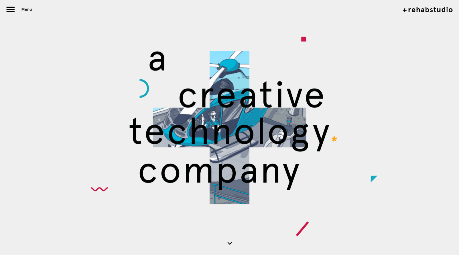
We’re starting to move away from the basic heading style seen on websites (san serif, all caps, centered heading) and moving more toward imaginative or creative headings. Changing up the heading style is a welcomed way to be unique in your design.
Changing up the justification and layout of the heading, adding unique elements to the heading, or even going without a heading (at least above the fold) are all ways in which designers are starting to experiment with changing up the typical heading style on websites.
Duotone gradient imagery
In the pursuit of staying more on brand, more brands are using duotone imagery and graphics for their websites. Even TNW has got the duotone down right, and it isn’t even 2017 yet.
Not strictly duotones, but some designs are even experimenting with two or three colors and using the duotone effect. Think Instagram. While flat design helped us get rid of (most) gradients, using duotone imagery that combines a couple of colors together has proven to be a nice update to the old and tired gradients and solid color areas.
Increased use of animations and GIFs
Animations are starting to be used more heavily on websites as they are often a great way to show how something works, how to do something, or otherwise reveal meaningful content. GIFs have been used for this purpose, but now we are seeng GIFs becoming more sophisticated and animations using SVG and CSS to achieve some pretty unique design elements.
I anticipate in 2017 the use of animations will become more prevalent, as more content types are shared and animation helps communicate things easier and quicker than text and video can. Plus, when done right, can often be even more lightweight than several images or even a video.
Navigation diets
As being a mobile society, I believe that because most of us access the web through our phones more than our computers, the overall trend to make things easier to navigate has taken over and reformed our navigation on websites.
Instead of overly complicated and long navigations, more and more sites are starting to simplify their navigation down to about four to five items. Keeping navigation to a minimum also helps visitors to focus on the intent at hand, instead of trying to find a way off the page.
Microinteractions
Microinteractions are the subtle, but powerful ways to interact with a website. They are often found in hovers, click animations, scrolling effects, etc. While we’ve always had these types of design elements, designers are spending more time on them, making them are informative and more refined.
Probably the most used integration is the hover/rollover, where a visitor can simply move their cursor over parts of the site to see these microinteractions and interact with the site in that way.
Increased use of hand-drawn elements
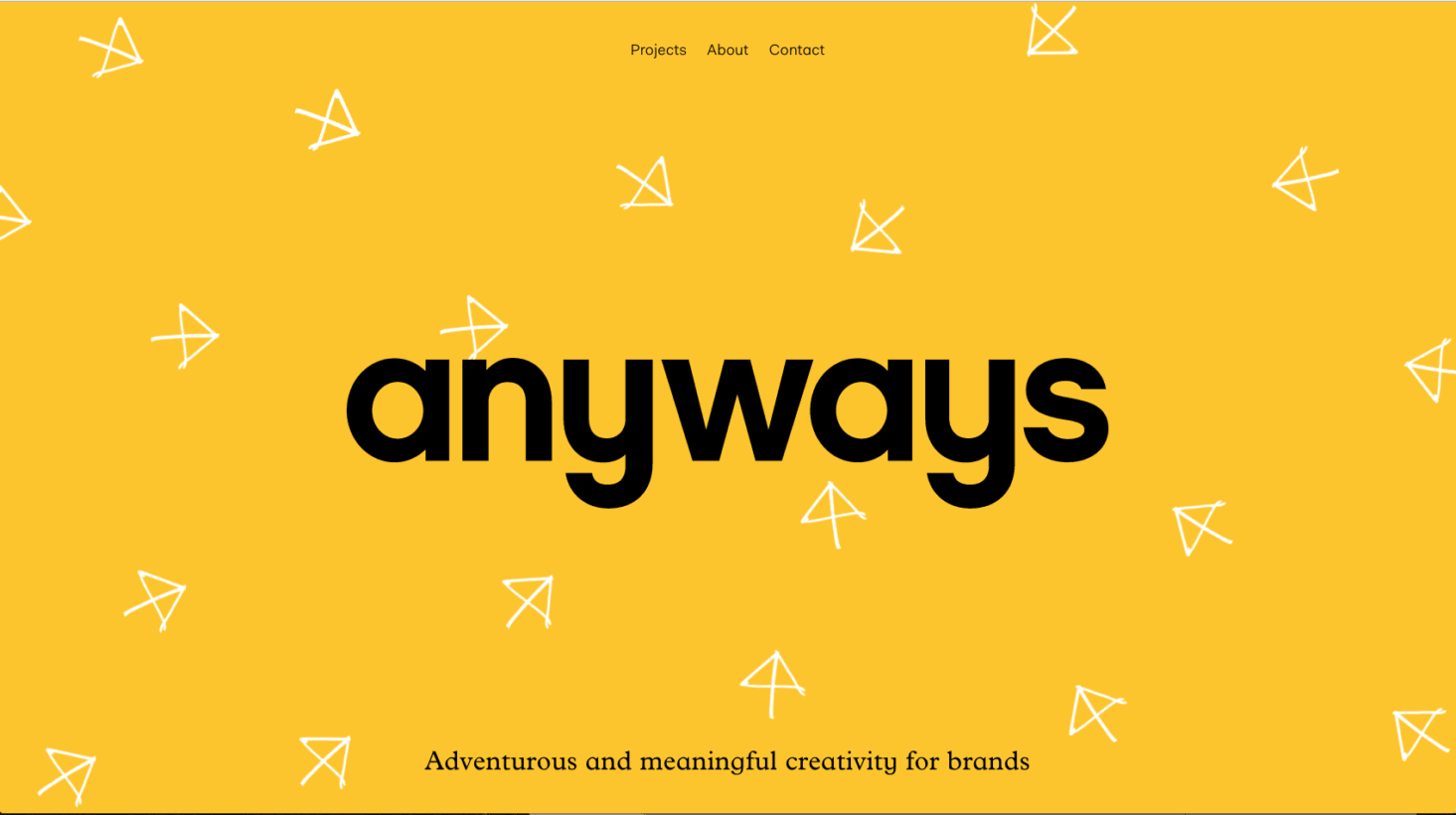
Perhaps a different type of web design trend is the increased use of hand drawn elements. These elements include fonts, icons, graphics, buttons and other elements that bring a nice unique touch to websites.
Websites have never been a medium that most would associate with drawing out, but the introduction and the subsequent takeoff of these hand drawn elements have been a nice change from using standard design elements.
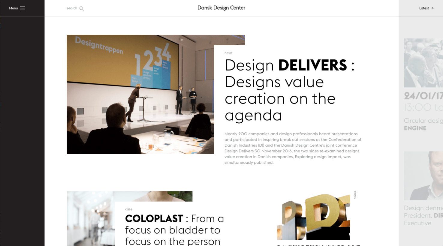
More emphasis on landing pages, less on a home page
As we refine content and opt to market and share it more, in 2017 we will likely see a rise in landing page designs instead of a home page design. While every website needs a home page, I think that as content marketing spreads, marketers will want to direct traffic to dedicated landing pages to better target their visitors and their needs.
It makes sense: The idea of content marketing is to increase awareness and conversions, and what better way to increase conversions than to have visitors land on a page strictly made for them. These pages will be as well designed and thought out as others on the site, but target the visitor much more.
Conclusion
2017 is sure to see some great websites, and these design trends will most definitely be seen on some of the best website designs yet to come.
From hand drawn elements to duotone images, imaginative headings to more focused content layouts, to microinteractions to animations, these design trends will dominate web design in 2017.
Recommended Posts

Top web design
02/03/2021

Evolve Studio Digital Studio
11/10/2019

Websites creation
09/05/2019