Mjeti i ri i Google ndihmon zhvilluesit të zgjedhin ngjyrat e duhura për aplikacionet e tyre

by Endrit Shehu
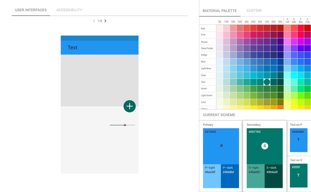
Me udhëzimet e saj të Material Dizajn, Google filloi të krijojë një sërë idesh të unifikuara për mënyrën se si dëshiron që zhvilluesit të mendojnë për të gjitha aspektet e ndryshme të dizajnit të aplikacioneve të tyre, duke filluar nga faqosja themelore deri te mënyra e përdorimit të animacioneve në mënyrë efektive. Si pjesë e këtyre udhëzimeve, gjithashtu ofroi disa ide se si të përdorim më së miri ngjyrën. Sot po zgjerohet me fillimin e një mjeti të ri të ngjyrave që synon të ndihmojë zhvilluesit dhe projektuesit të zgjedhin paletën e duhur të ngjyrave për aplikacionet e tyre.
 Mjeti i ri i ndihmon zhvilluesit të krijojnë dhe ndajnë paleta me ngjyra, por, ndoshta më e rëndësishmja, gjithashtu vjen me aftësinë për të aplikuar atë skemë të ngjyrave në një ndërfaqe përdoruesi të mostrës dhe në komponente të ndryshme të Dizajnit të Materialeve në CodePen, për zhvilluesit e front end-it.
Një tjetër aspekt interesant i mjetit të ri është se ai automatikisht vlerëson lexueshmërinë e tekstit për skemën tuaj të ngjyrave. Ky vlerësim bazohet në Udhëzimet për Aksesueshmërinë e Përmbajtjes së Uebit, të cilat kryesisht fokusohen në kontrastin midis tekstit dhe sfondit për të ndihmuar njerëzit me dëmtime të shikimit, të lexohen më mirë në internet (edhe pse dikush që ka pasur ndonjëherë të lexuar shumë tekst të errët të errët në një sfond gri të lehta e di se kjo është një çështje).
Recommended Posts

Agjensi Dixhitale Tirane Evolve Studio
11/10/2019

Krijimi i faqeve te internetit
09/05/2019
